Other ways to adjust your modals other than with a fade in and fade out effects

Modals are an integral part of front end development — they allow you to focus attention on only certain parts and get rid of other noise in the background. They also allow you to create a view without having to navigate to a completely separate page for just a quick look at something on a larger scale, or quickly gain some more information on something.
I remember the first time I tried creating my own modal and kept setting the body’s background color to black or messing with it’s opacity and it would also affect the modal too. I could’ve obviously googled something up, but what’s the fun with that!? Then a friend said you just have to create a div that covers the whole page / view and set the background to it instead; at the time it was quite mind-blowing — it really takes a different kind of mindset dealing with the front end.
Basic Fade Implementation

Let’s get started with the most basic way of a functioning modal — with fade! I’ll review the setup I have going and some reasons as to why I went with it.
The HTML
With a basic application I try to maximize the amount of HTML I have to lessen the necessary JS — adding and removing nodes and other elements is just more strain and work for the app and browser. With that said, I started with a basic layout for the modal that I intended to use JavaScript and CSS to show and hide it.
<div id="modal" class='modal'> <button id='modalCloseBtn' class='modal__button modal__button--close' tabindex="0">X</button> <div id='modalContents' class='modal__contents'> <!-- <img id='modalImage' class='modal__image' /> --> <p id='modalImgDesc' class='modal__image__desc'>description here</p> <section class='modal__image__details'> <span id='modalImgDate' class='modal__image__date'>Dec 13,2018</span> <span id='modalImgLikes' class='modal__image__likes'>999</span> <span id='modalImgUsername' class='modal__image__username'>someone</span> </section> </div></div>
Trying to follow the BEM naming conventions here — seems quite repetitive and unnecessary but does seem to scale very well and easier to maintain later on.
Maybe the above is difficult to follow so here’s the structure:
-div
  -button
  -div
    -img
    -p
  -section
    -span
    -span
    -span
The CSS
.modal {
  position: absolute;
  opacity: 0;
  transition: all 500ms ease-out;  .modal__contents {
    background-color: rgba(0, 0, 0, 0.9);
    width: 100%;
    height: 100%;
    display: flex;
    flex-direction: column;
    align-items: center;
    justify-content: flex-start;    .modal__image {
      width: 100%;
      max-height: 80vh;
      object-fit: contain;
    }    .modal__image__desc {
      width: 100%;
      text-align: center;
      font-size: 2em;
      padding: 0.5rem 0;
      border-bottom: 1px solid rgba(100, 100, 100, 0.5);
      margin: 0;
      background-color: floralwhite;
    }    .modal__image__details {
      display: grid;
      grid-template-columns: auto auto auto;
      width: 100%;
      height: 3rem;
      background-color: floralwhite;      * {
        width: 100%;
        text-align: center;
        margin: auto;
        border-right: 1px solid rgba(100, 100, 100, 0.5);
      }      span:last-of-type {
        border-right: none;
      }
    }
  }  .modal__button {
    border: none;
    padding: 0;
    border-radius: 50%;
    background-color: grey;
    box-shadow: inset 0 0 0 1px rgba(50, 50, 50, 0.5);
    color: floralwhite;
    width: 3rem;
    height: 3rem;
    z-index: 5;
    display: flex;
    justify-content: center;
    align-items: center;
    font-family: 'Bolby One', cursive;
    cursor: pointer;
  }  .modal__button--close {
    position: absolute;
    top: -1rem;
    right: -1rem;
  }}
The absolute positioning is important as it separates itself from the layout and doesn’t add any extra spacing to the underlying structure, essentially below or under the modal when it is visible. And in order to create the fade effect you need to start with an opacity of 0 and ending value of 1 along with its transition defining the type and duration of the effect.
The JavaScript
Here all you have to do is add an event listener that will wait for a click on a button or some element you want to trigger when the modal should open. When it is clicked then either add an opacity of 1 to the modal or create a CSS class with the opacity value set to 1 and toggle it on and off the modal.
document.addEventListener("DOMContentLoaded", _ => {
  const modal = document.getElementById("modal");
  const button = document.getElementById("openModalBtn");
  // or whatever the element triggering the opening of the modal  button.addEventListener("click", e => {
    // add the opacity of 1 to the modal here or toggle a CSS class
    // the latter would look like this:
    modal.classList.add("appear")
  })}).appear {
  opacity: 1;
}
I personally prefer to setup CSS classes with necessary instructions and toggle the class names because it is a better structure to keep all CSS in the CSS and only use inline CSS with JS if it can’t be done any other way for your use-case. It’s easier to find what you’re looking for later on and if multiple people are looking at it then they would know where to look.
Transformations
Awesome! We have a working modal that can appear and disappear via fading in and fading out (just do the reverse for the fading out effect and revert back to opacity 0).
My use case wasn’t to use a button to open the modal, but rather a picture on a masonry layout. I added the event listener to the container and used event delegation to limit the amount of event listeners on the page, and also because when the page loads the pictures aren’t on the page yet as I use JS to add these elements after doing an external fetch to a picture API.
When I found myself testing out the modal, somehow my eyes were focused on exactly where I was clicking and it reminded me of how some web pages have the effect where the modal would essentially pop up and appear from the origin of the click event!
Immediately I knew I could use the CSS scale transformation property to help with this effect, but was unsure how to tell the modal’s transition to start from the origin and location of the click event. I was already familiar with grabbing the X and Y values of the click event and tried to figure out a way to use it to create this effect. It sounded a lot like what you do with the transform-origin property, and after a little bit of testing it was the pot of gold I was seeking!
// JavaScriptimagesWrapper.addEventListener("click", e => {  const check = e.target.dataset.type === 'pic';  if (check) {    const picture = e.target.dataset;    modal.style.transformOrigin = `${e.clientX}px ${e.clientY}px`;    handleOpenModal(picture);  }})const handleOpenModal = (data) => {  modal.dataset.id = data.id;
  addModalImg(data.url);
  setupModalDesc(data);
  modal.style.width = 'calc(100% - 2rem)';
  modal.style.animation = 'appear 500ms ease-out forwards';  document.body.classList.add("noscroll");
  document.addEventListener("keydown", handleEscKey);
}// CSS@keyframes appear {  0% {
    position: absolute;
    z-index: 100;
    display: flex;
    transform: scale(0.1);
    transition: all 500ms ease-out,
    transform-origin 1ms;
  }  100% {
    position: fixed;
    z-index: 100;
    display: flex;
    opacity: 1;
    transform: scale(1);
    top: 1rem;
    left: 1rem;
    right: 1rem;
    bottom: 1rem;
    justify-content: center;
    align-items: center;
    box-shadow: 0 0 0 2rem rgba(0, 0, 0, 0.8);
    background-color: rgba(0, 0, 0, 0.9);
    }
}
I took this little trick from Kevin Powell where instead of having an extra div for the background to darken everything behind the modal, you can set a box shadow for the space it doesn’t cover up — there’s 1rem of space the modal doesn’t cover and to be safe I just set it to 2rem.
*It’s important that I set the transform-origin to 1s for the transition otherwise there would be a delay.
After a few iterations of testing I noticed that it wasn’t working the way I had intended — I imagine many say this when working with CSS! I realized that the transform origin was being updated accordingly but it didn’t have enough time to register prior to opening the modal and so it wasn’t a complete and smooth transition. The start of the scaling up would always be of the prior click event’s location rather than the current. That told me that I needed to open the modal only after the transform origin property was set.
So I looked into how I could use the transitionend event listener since it sounded like the perfect time to be using it and my instincts were on the money! I removed the open function from that event listener and into the transitionend event listener to be invoked only after the transition origin property was set in an asynchronous manner.
modal.addEventListener("transitionend", (event) => {
  triggerModalTransition(event, picture)
});
const triggerModalTransition = (event, picture) => {  if (event.propertyName === 'transform-origin') {    handleOpenModal(picture);    modal.removeEventListener("transitionend", triggerModalTransition)  }
}
Violà! It seemed best to constantly adding and removing the event listener so it doesn’t conflict with any others and to minimize the amount of listeners on the page at once.
Sliding Animations
I’m trying to remember why I ended up with a slide-down animation upon closing the modal, but I think it was because it felt janky — looking back now it might be because of my implementation and/or because of the transform origin. To be honest, I didn’t care for a complex and nice closing transition and decided to implement a simple slide-down transition as it fades out.
It seemed simple enough but I couldn’t get what I wanted and it was because I had the scaling transformation and transform origin properties on the modal. In order to combat that I created a keyframes animation to ensure it would maintain the proper properties I was looking for as it moved from it’s current position downwards and out of view as it faded out.
@keyframes slideDown {  0% {    position: fixed;
    width: 100%;
    height: 100%;
    top: 0;
    opacity: 1;
  }  100% {    position: fixed;
    width: 100%;
    height: 100%;
    top: 100%;
    opacity: 0;
  }
}
And like I mentioned earlier, I try to keep all of the CSS there and just add and remove classes to toggle it. But in this case I think I was dealing with prioritization and instead went with inline CSS.
const handleCloseModal = () => { removeModalImg(); modal.style.animation = 'slideDown 500ms ease-out'; document.body.classList.remove("noscroll"); document.removeEventListener("keydown", handleEscKey);}
Show / Hide Difficulties
I faced quite a few issues when deciding how to best implement showing and hiding the modal. I know I wanted it in the HTML and to toggle it with CSS and JS instead of creating it within JS and removing it every time. It had to stay on the page but hidden from the view and not disrupt any part of the layout in any unintended way.
Display
Naturally this is the most common way to do this. When you want the modal to appear, you set the display to block or something other than none. And when you wanted the modal to be gone, you can then just set it to none. I ran into an issue where I couldn’t adjust any of the modals CSS properties because it was set to a display of none and had to venture into a different path.
Position
I wanted this web application to be well responsive and mobile-friendly and having a position of relative would’ve disrupted that. I stuck with using an absolute and fixed positioning to avoid being included in the actual layout and structure of the page and it’s components / elements.
Width
With a display of something other than none and an opacity of 0 and even a position of absolute or fixed, I was still seeing evidence of its existence when it wasn’t supposed to be there. It proved a little bit difficult dealing with mobile responsiveness do to this as the 100% of the body width was somehow skewing off to be less than the actual viewport. To solve this I adjusted the modal’s width setting it to 0 to disappear and 100% when it should appear.
End Result
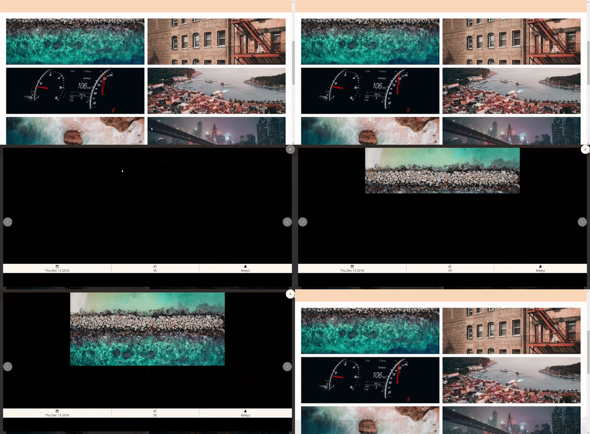
It’s a big sluggish and slow because the photos for the modal I chose from Unsplash’s API are high resolution and therefore large files to be downloaded with my slow PC and 3mbps wifi. But you can see the hint of success in it!
It gives the impression it is growing from where you click!

Live Demo
You can play with it here as a live demo deployed on Heroku.
